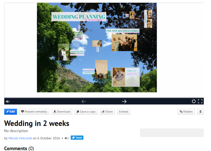
A screen shot of my Prezi presentation
All the photos were mine including the background. I went through and changed all the titles to match in font and color as well as the body copy. I liked adding the touch with the music playing in my presentation. Although with technology things come up and certain processes don’t work so I had to come up with a work around. I couldn’t get the print screen function to work on my PC/Windows computer so I had to search for a method to get it to work.
I tried to use similar fonts that were found in the announcement that was included in the presentation. And used a Serif font called Abril Fatface, and for the body copy I used Open Sans Condensed font to get as close to the fonts as I could. The colors I chose were a teal green and kind of a fuschia color that was available in the creation software.
I made sure to keep some interest by rotating a few of the pictures so it added more animation to the presentation which I feel adds more of a WOW factor, as well as adding in some music that I had on my computer, that I’m not sure where it even originated from.
I definitely think I’ll use this program in the future. It was right up my alley in being creative and unique. Now that I have the basics of the program down, I think I can be even more creative.
I failed to do a thumbnail sketch at first. But after not using one, I see the importance of having one. From now on that is what I’ll be sure to use.

Nice job, Wendy! I like that you used the same color scheme for your presentation as you did for your wedding. I also like the contrasting text boxes behind the text. That allows for more readable slides. It looks like you had a wonderful wedding and had a lot of fun!
Check out Dave’s presentation here:
http://redirwin.com/prezi-presentation-project/
Check out my presentation here:
https://chelsiebradycomm.wordpress.com/2016/10/05/week-4-prezi-presentation/
LikeLike
Hello Wendy, I love the changes to color scheme and typography that you made. I also love that you have music so many of the prezi would be so much better with some music. I also love the way you turned the slides going around till we got to the center. Yours was very fun and interactive. Check out mine at https://thewebbdesign.wordpress.com/category/designs-comm130/
LikeLike